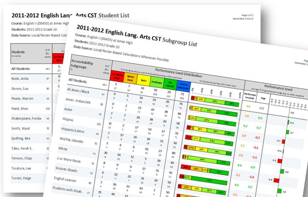
A recent Harvard Business Review post titled How P&G Presents Data to Decision-Makers (Davenport, 2013) calls attention to the power of consistency in data displays. While written about the business industry (with Proctor & Gamble used as an example), there are compelling arguments for consistency (in both data displays and the info that relates to those displays) that also ring true for education. For example, consistency is noted in 4 of the 5 over-the-counter data (OTCD) components’ standards for edtech data systems, where consistency supports transference of skills and ease of use when viewing reports (label and package/design), supplemental documentation, and help system lessons.
Here are some points made by Davenport (2013) that all relate to OTCD, as well:
- Commonality is favorable to creativity when displaying data for those in a large organization, as having a common visual language for data dramatically improves the use of the data to inform decision-making and action.
- The real goal of data displays is not to dazzle but to help users quickly understand what's going on and decide what to do about it.
- Good visual data displays limit the time decision-makers need to spend figuring out the data and allow them time to determine why it happened or what to do about it.
- Commonality is not only important for data displays across an organization but also for the information itself, such as what info is used to address a particular problem, key variables, etc.
Creativity is wonderful (with a bachelor’s degree in Art Studio, I’m a big fan). However, evidence strongly suggests a suite of reports used for serious decision-making, such as that done for the benefit of students, should display data in consistent ways when possible (as the display that best supports the particular data’s accurate analyses is primary) and use consistent sets of info when possible (such as the info contained in 1 abstract to the next, 1 interpretation guide to the next, etc.).
P.S. Another enjoyable link from the past month: Data Visualization Best Practices 2013