OTCD Makes Appearances at Edukwest & EdTech Women

A piece I wrote for Edukwest titled Over-the-Counter Data Is the Next Frontier for Data in Edtech just posted. It summarizes what over-the-counter data (OTCD) is, why it’s needed, and what varied roles (educators, edtech staff, and edtech investors) can do to help educators’ data use.

If you haven’t checked out Edukwest before, I strongly recommend it.  Based in the French countryside, the site and its founder, Kirsten Winkler, constitute a highly informative, global voice in the realms of education and edtech.

On another note, I also wrote a piece for EdTech Women that posted recently. If you’re a woman interested in leaning in, check out EdTech Women and the Birth of an Industry. Also, consider signing up for the exciting EdTech Women while you’re there.


Visit www.jennyrankin.com/subscribe to subscribe to this blog.


The New York Times Teaches Us about Data Display

Jonathan Corum of The New York Times posted an abridged version of a wonderful keynote presentation on Storytelling with Data (Corum, 2013). I encourage anyone interested in the communication of data to check it out.

In discussing graphics and data visualization, Corum (2013) made important distinctions between data visualization and other data displays, noting data visualization assists understanding of the data but often doesn’t explain the data, so data visualization shouldn't be mistaken as a tool to be used in decision-making if it's missing the explanatory element. Reports and graphs with more explanatory punch can serve that purpose. This is a distinction I addressed in A Place for Graphing Fun, as decision-making in education needs to be based on reports and report elements (e.g., graphs) that adhere to over-the-counter data (OTCD) recommendations. 

Corum (2013) also touched on OTCD components. For example, he did a marvelous job explaining the importance of considering audience (Audience Appropriate is 1 of the OTCD Content standards) and was clear in stipulating the graphics’ creator is not its audience. This is a vital distinction in ed-tech, where data system programmers typically differ greatly from their educator audience; e.g., only 22% of computer programmers and 21% of computer software engineers are female (U.S. Department of Labor, U.S. Bureau of Labor Statistics, 2011), whereas 75% of all teachers and 84% of elementary teachers are female (Papay, Harvard Graduate School of Education, 2007), to pick 1 of many common differences. Even in cases where report creators mirror their clients’ demographics, they still need to speak to a range of users – something Corum explained well.

Some of my favorite points Corum (2013) made related to the OTCD Package/Design component. For example, he illustrated the effectiveness of removing clutter (OTCD’s Avoid Clutter standard), modeled how to reserve the use of graphing for main points (OTCD’s Graph When Appropriate: Use for Key Info/Comparisons  standard), and presented multiple examples of appropriate simplification (OTCD’s Not Unnecessarily Complicated standard). Though a data system’s reports are different from the pages of The New York Times, these good design principles for data communication are effective in both venues.


Visit www.jennyrankin.com/subscribe to subscribe to this blog.


Data System Users Care Most About How Data Is Communicated Back to Them

SAS released 2013 Big Data Survey Research Brief (SAS, 2013), summarizing results from a global survey concerning organizations’ use of big data. When the 339 respondents were asked what they wanted from data management systems, their #1 answer (73%) was “data visualizations and dashboards.” While administered in the business realm rather than to educators, these findings echo educator sentiments that are sometimes not reflected in data system priorities: the whole reason educators are using a data system is to get helpful info out of it. It matters not how quickly, easily, attractively, and “high techie” data is collected and stored if the ultimate product – the manner in which that data is reported back to educators – is deeply flawed. This disconnect between educators’ needs (backed by research findings indicating properly-displayed data better assists educators’ analyses and thus students) and data system displays is one of the key factors driving the Over-the-Counter Data (OTCD) movement.


Fortunately, some entities are tackling the problem of voices from research and education not being reflected in edtech products. For example, EdSurge (Wan, 2013) reports the massive MindCET edtech inclubator in Israel has structured whole departments around educators and researchers, involving them directly in the edtech innovation process. Even the center’s description notes its role as bringing together entrepreneurs, educators, and researchers. As EdSurge (Wan, 2013) notes, this is a welcome change from models where teachers were relegated to the background in similar edtech projects. The sooner data system companies shift to models where research and educators play pivotal roles in the way data display is planned and executed, the better.


Visit www.jennyrankin.com/subscribe to subscribe to this blog.


Proactive Data Use Acknowledges OTCD Components

SAS just put out a new whitepaper, How Districts Use Data to Drive Proactive Decisions: Benefits and Best Practices for Creating a Data-Rich Culture (SAS, 2013), coinciding with a free Education Week chat today, March 29, 2013: Delivering Data to Improve Schools. As a means of improving data use, the whitepaper focused primarily on the need to use diverse sources of data to draw timely analyses throughout each school year, and on the type of district culture necessary to make this happen. These points transitioned into an example of how the SAS system is working well at a large school district. SAS pulls data from multiple systems a district is using (in cases where a district doesn’t have a single system that “does it all,” as Illuminate Education is known for bringing to the ed-tech market). The paper touched only lightly on aspects related to over-the-counter data (OTCD) in the area of Package/Design (OTCD assumptions like a user-friendly interface), but was a bit more explicit on OTCD needs when discussing Content (e.g., audience-specific dashboards and reports serving a variety of specific needs).

Today’s discussion more directly acknowledged the role of a data system’s design in educators’ data use, which are elements OTCD asks of data systems after they have the basics covered (the basics being things like unique student IDs and timely access for all users – things long-accepted but nonetheless dominating most ed. conversations concerning data systems).When asked what data system features are most important in delivering data for school improvement,  Laura Hansen, Director for Information Management & Decision Support at Metro Nashville Public Schools, noted 3 areas, with 1 being the need to show relevant data in an understandable way, adding, “data visualization is extremely important.”

I was glad to see Hansen call attention to this important aspect of OTCD (Package/Design and Content), and also to note the strategy of enlisting online resources for PD (in OTCD, this would be delivered via the Help System). I was also thrilled to see Paige Kowalski, Director of State Policy for the Data Quality Campaign, talk about data literacy and note, “now it's time to focus on how educators can use (and not misuse) data.” Kowalski talked more about the types of reports needed (e.g., early warning systems / predictive analytics), which hits OTCD's Content area, and Hansen noted how the reports they use are always improving. That last comments hits one of the driving factors behind OTCD: that data systems and reports need to improve.

 

Visit www.jennyrankin.com/subscribe to subscribe to this blog.


Tomorrow’s School Leadership Summit: Data-driven Reform & More

When an education conference is online and free, it shows sensitivity to educators’ busy schedules and strained budgets. When such a conference is also packed with 70 high-quality presentations from all over the world, that conference is one of my favorites. The Technology Information Center for Administrative Leadership (TICAL), led by Steve Hargadon, brings us this conference tomorrow: The 2013 chool Leadership Summit, March 28, 2013, 6:30 A.M. to 7:00 P.M. PDT.

Visit http://admin20.org/page/schedule to attend, and click on your time zone to view the presentation schedule. Presentations are tagged according to the International Society for Technology in Education (ISTE) National Educational Technology Standards (NETS) for Administrators to which they are aligned. Over-the-counter data (OTCD) relates to all 5 of these standards, but especially to those concerning vision, learning, and the use of data for systemic improvement and reform.

A presentation specific to OTCD, How Data Systems & Reports Can Either Fight or Propagate the Data Analysis Error Epidemic, and How Educator Leaders Can Help, will take place at 3:00 P.M. PDT. The 1-hour presentation will show attendees how to evaluate their data systems &/or data reports using research-based ways in which these systems can better assist the accuracy with which staff analyze data. I.e., the presentation will cover all components of OTCD. I hope to see you there!


Visit www.jennyrankin.com/subscribe to subscribe to this blog.


A Place for Graphing Fun

I will always love infographics and creative takes on data visualization. Taking an unusual approach to graphing something can communicate an added layer of meaning when the graphing style is catered specifically to that added message. There is great potential for fun with such graphics, as found in resources like Graph Out Loud: Music, Movies, Graphs, Awesome, by GraphJam, where works of pop culture are graphed for entertainment.

To demonstrate, I’ve created my own such infographic (click on image to enlarge), which combines 2 mirrored line graphs and a pie chart to illustrate the song “Escape (The Piña Colada Song)” by Rupert Holmes. This infographic violates many of the research-informed rules of OTCD. However, graphics like this don’t have to follow OTCD because there are no repercussions for not understanding the info they communicate. Data visualization that accompanies presentations (like those at TED.com) also violates rules at times, but those images have the added element of live commentary to compensate, and their required understanding tends to be based more on emotion or a general picture than on understanding specific datasets. Hence the data visualization within TED presentations works well for what it’s intended (I'm a big TED fan).

It’s great to have fun with data and graphing, but if you’re communicating data for which understanding vs. not understanding that specific data has consequences, adhering to OTCD package/design standards is paramount. There are few consequences direr than those that impact students; hence, education data warrants serious package/design considerations and the benefits of OTCD. Fortunately, there are still plenty of other areas for fun with graphing.


Visit www.jennyrankin.com/subscribe to subscribe to this blog.


TCR Misses the Mark on Quantitative Data & DQC

Blog032113-PiperDistraughtNarrow.png

I don’t normally “blog in the negative,” but Take a Number, Stand in Line, Better Yet, Be a Number Get Tracked: The Assault of Longitudinal Data Systems on Teaching and Learning (Teachers College Record, Date Published: March 08, 2013, http://www.tcrecord.org, ID Number: 17051, Date Accessed: 3/21/2013) exemplifies a dangerous attitude of which educators & data providers should be aware. The article was brought to my attention by a post by Jeffrey C. Wayman, one of the world’s true heroes in data use research (I flew to Austin to meet him last year because I so admire his research & its role in helping with the kinds of topics tackled by OTCD).


In the TRC article, the Data Quality Campaign (DQC) & varied aspects of quantitative data (such as the assignment of unique identifiers to students, one of a data system’s basic needs) get slammed despite a wealth of research supporting the benefits of quantitative data & the benefits of the types of recommendations DQC advocates. The authors’ implication that using quantitative data means automatically ignoring the value of qualitative data was one of the article’s many inaccuracies.

I get scared when critics jump on the extreme-opposite side of matters (e.g., so anti-quantitative data). While careless use of quantitative data can be dangerous (i.e., a pro-data extreme), so is the opposite side of the spectrum (i.e., this article’s dismiss-quantitative-data extreme). So much more is achieved when varied opinions recognize the value of others (e.g., the value of DQC) & work together for a common good.


Visit www.jennyrankin.com/subscribe to subscribe to this blog.


Hack Ed. Calls for Better Ed-Tech Design (Amen!)

As I read “& This Is Why We Can’t Have Nice Things…” by Audrey Watters of Hack Education, I found myself saying, “Amen!”  In lamenting changes in the ed-tech startup LearnBoost, Watters notes ed-tech shortcomings & the problems with building & adopting ed-tech tools that rely on user training simply because they are poorly (e.g., not intuitively) designed. For education data systems, these are some of the exact problems over-the-counter data (OTCD) helps to solve. Of course, OTCD can only solve the problems when it is utilized. Thus I was also pleased to see Watters calling for educators to start demanding improved ed-tech & for ed-tech creators to start building better ed-tech. For this to happen with data systems, educators need to call for OTCD & data system vendors need to implement it to rectify the kinds of problems of which Watters writes. Seeing that happen will give us all – educators, data system vendors, & (most importantly) students – reason to celebrate.


Visit www.jennyrankin.com/subscribe to subscribe to this blog.

Ed. Week Tech. Report Reflects Several OTCD Attributes

Education Week’s latest edition of Technology Counts 2013 focuses on building the digital district, which includes online PD and improving data use. Several OTCD standards were reflected in its pages:

  • Linda Jurkowitz’s data graphics reflect many OTCD Package/Display standards of good design. For example, in the last 2 graphing sections, notice how she still manages to keep the wording of categories directly next to the bars graphing that graph them (rather than using a legend or key), even though the verbiage is extensive. Notice how she picked designs that lend themselves well to accommodating these wordy categories.
  • The reference to rampant data use makes OTCD concepts all the more dire. For example, 85% of school districts either already offer data dashboards (67%) or else are in the process of implementing them (18%) (Center for Digital Education, National School Boards Association, & Converge Online, 2012; Vander Ark Davis, 2013). With so many districts already having access to such displays, it’s time for attention to shift from asking for such displays to asking for more from such displays.
  • OTCD components such as Supplemental Documentation and Help System are based on a need for more immediate and accessible PD. Education Week’s Report reflected problems with current PD setups. Among both K-12 educators and post-secondary educators, one of the most critical gaps in educational technology is educators' access to online PD and related resources, with only 28% of school districts having such access (Software & Information Industry Association, 2012; Vander Ark Davis, 2013). Traditional training session approaches, such as 3-hours on a workday or 45 minutes after an exhausting day of teaching, aren't working; to truly integrate technology, teachers need access to immediate help wherever they are using technology (O'Hanlon, 2013).


Visit www.jennyrankin.com/subscribe to subscribe to this blog.

Source: http://www.edweek.org/ew/tc/2013/25infogra...

Future of Assessment in Ed. Calls for “Actionable” Info

The Gordon Commission on the Future of Assessment in Education released a report calling on educational organizations to join a 10-year research and development effort focused on improving assessments nationwide. The report acknowledges the importance of post-assessment feedback, noting assessment systems need to include tools that give educators actionable info about their students. This enters the realm of Over-the-Counter Data (OTCD), which involves steps to make data actionable, as opposed to static, confusing, or misleading.


Visit www.jennyrankin.com/subscribe to subscribe to this blog.

Source: http://www.edweek.org/media/gordonpublicpo...

Ed-Fi Alliance Dashboards & Reports

The Michael & Susan Dell Foundation announced the formation of a non-profit LLC designed to support educators’ data-driven decision-making by consolidating and displaying data from varied sources. Ed-Fi Alliance’s dashboards and reports show some OTCD components in terms of Label (e.g., footers) and Package/Display (e.g., purposeful use of color and strategies to reduce clutter). Ed-Fi Alliance’s site and sample reports are worth exploring.


Visit www.jennyrankin.com/subscribe to subscribe to this blog.

Source: http://www.ed-fi.org/news/2013/03/michael-...

Spotlight on Data-Driven Decision-Making

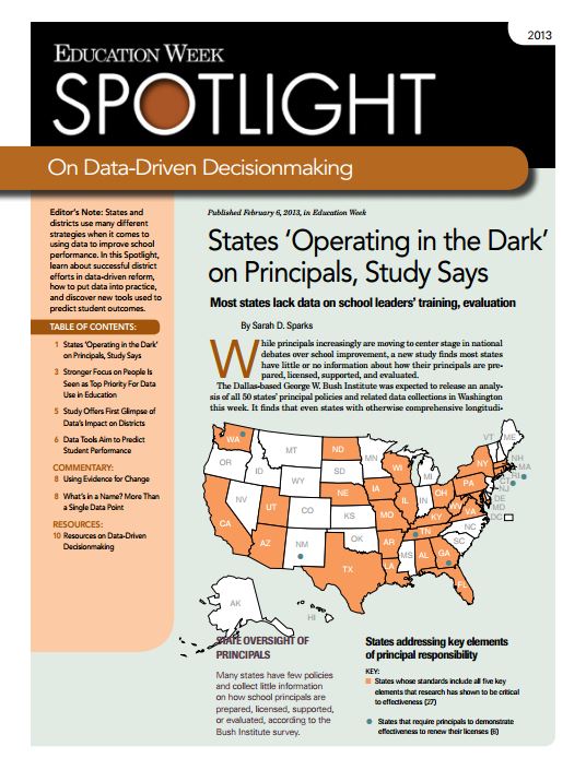
Education Week released a collection of articles focused on data use and the tools that facilitate this use. While little was said of OTCD design concepts relating to data systems and their reports, there were some related insights. For example, after working with educator focus groups to improve the helpfulness of their feedback reports, postsecondary enrollment growth in the state of Kentucky rose from 50.9% in 2004 to 61.4% percent in 2010 (Ash, 2012). Also, on the note of data use in general, a study of 59 districts in 7 states indicated students in districts where teachers utilized data-driven decision-making outperformed control-group districts' students by approximately 8 percentile points in math and 5 percentile points in reading (Zubrzycki, 2012).


Visit www.jennyrankin.com/subscribe to subscribe to this blog.

Source: http://reg.accelacomm.com/servlet/Frs.FrsG...

Predictive Analytics for OTCD Content

The U.S. Department of Education Office of Educational Technology released a new report, Expanding Evidence Approaches for Learning in a Digital World. “Chapter 3: Combining Data to Create Support Systems More Responsive to Student Needs” offers info & resources that can help a data system offer over-the-counter data (OTCD). While the report ignores most OTCD components, such as Package/Design standards related to the design of data systems, the info & resources are very helpful in addressing datasets that can be used as indicators related to risk, graduation, and college readiness. Such indicators fall within the Content component of OTCD and are related to an important reason for using a data system: predictive analytics.

Visit www.jennyrankin.com/subscribe to subscribe to this blog.


Data System Study & Free Training

A Southern CA study will examine how data systems & their reports can best embed data analysis guidance to improve the accuracy of educators’ data analyses. The study is anonymous & takes up to 20 minutes (10 multiple-choice Qs). Participation comes with an optional hour of free training on common core transition, data analysis, or assessment building. First come, first serve on coordinating participation for your school or district staff.


Visit www.jennyrankin.com/subscribe to subscribe to this blog.

Learning Analytics in Higher Ed.

The New Media Consortium (NMC), in collaboration with EDUCAUSE Learning Initiative (ELI), just released the NMC Horizon Report: 2013 Higher Education Edition. Its pronouncement of learning analytics as one of the 6 most auspicious technologies that will impact the future of higher ed. indicates another opportunity for over-the-counter data (OTCD) to impact students beyond their K-12 classrooms.


Visit www.jennyrankin.com/subscribe to subscribe to this blog.